terça-feira, 24 de março de 2015

Enhance your chart label


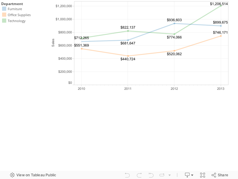
By default Tableau gives you some options to decide when to show the mark label: All, Min/Max, Selected, Highlighted or Line Ends (for the line chart).

What if you want to have different options, such as "Max & Line Start" or "Min & Line Ends"?

To achieve that you need to create a calculated field to be used in the mark label:

IF 
     <CONDIDITON>
THEN
     <VALUE TO SHOW>
END

The <CONDITION> will depends of what you wanna show:

//SHOW MAX VALUE
(WINDOW_MAX(SUM([Sales])) = SUM([Sales]))

//SHOW MIN VALUE
(WINDOW_MIN(SUM([Sales])) = SUM([Sales]))

//SHOW LINE STARTS
FIRST() = 0

//SHOW LINE ENDS
LAST() = 0

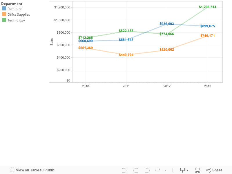
You can also mix those conditions.
For instance, you wanna show the Max & Line Starts as we said before:
IF 
     //SHOW MAX VALUE
     (WINDOW_MAX(SUM([Sales])) = SUM([Sales]))

     //SHOW LINE STARTS
     OR FIRST() = 0

THEN
     SUM([Sales])

END


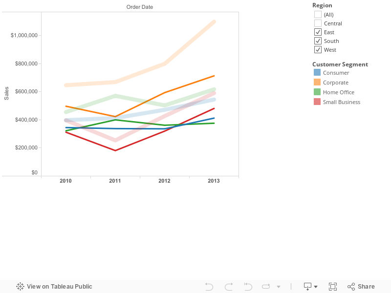
You can also use that logic to color your chart. Just need to change the calculation to boolean.
For instance, you wanna color with orange the Min & Line Ends:

     //SHOW MAX VALUE
     (WINDOW_MIN(SUM([Sales])) = SUM([Sales]))

     //SHOW LINE ENDS
     OR LAST() = 0


You may use parameters to add interactivity (click on the image to be directed to Tableau Public):

5 things that can help your Analytics & BI iniciative


#1 - Understand your data environment
Take a few minutes to understand your data model and what your environment is capable of.
You dont want to end-up waiting your visualization to query a table with billions of rows in a environment that will takes hours to return.

#2 - Analytics tools does not make miracle (yet...)
Most recent analytics tools have a lot of capabilities, numerous charts and so on.
Although they can't guess what is your mind, they are here to help you!
So, if it seems too complicated to materialize in a visualization what you have in mind, try to start from a simple one and use the power of the tool to improve it until it looks like you had in mind.
And be aware: each tool has its particularity: in one tool the chart may be green and in the other it is blue.
Be ready to adapt as much as possible.

#3 - Share your expectation with the appropriate people
Is your visualization slow? Did you check your generated query? Does the IT, which created your data environment, knows how you planned to use the data and your performance expectation?
Sometimes you may want to have results in a few seconds and the IT thinks minutes are fine. So, talk to them.

#4 - Use the best of what you have and add value
Self-service data preparation tools are meant to prepare your data.
Data visualization tools are good in display data and enhanced insights.
Do not try to invert the roles.
If more than one tool is needed to do the whole job, mix the tools and use the best of each one.
In other words, create synergy with your tools.
 
#5 - Think out of box and have a open mind
Working a long time with the same tool or visualization may lead you to miss great insights and opportunities.
Try to do the things in differents ways and do not be chained to the same work method.
There is always a new technology that will helps you. So, don't be afraid to check what's new.

sábado, 21 de março de 2015

Tableau Data Extract #1 - Aggregation

 Why to use the Aggregation option?

If you decide to extract the data instead of use live connection, there is an important option, called Aggregation, which can save disk space, reduce extract time and improve your visualization performance.
When you use Aggregation option, you are telling Tableau to perform an aggregated extract, which means that all the measures will be summarized (avg, min, max, depending of what you choose as default aggregation) by the visibles dimensions.

In a simple way, if you do not choose to use aggregation, this will be the query used to extract the data:

SELECT 
DIMENSION_1, 
DIMENSION_2, 
...DIMENSION_N, 
MEASURE_1, 
MEASURE_2, 
...MEASURE_N
FROM TABLE

But, if you choose to use the aggregation, this will be the query:

SELECT 
DIMENSION_1, 
DIMENSION_2, 
...DIMENSION_N, 
SUM|MAX|MIN|AVG(MEASURE_1), 
SUM|MAX|MIN|AVG(MEASURE_2),
...SUM|MAX|MIN|AVG(MEASURE_N)
FROM TABLE
GROUP BY DIMENSION1, DIMENSION_2, ...DIMENSION_N

Example

We will extract the below table (sales table), which has 31 records and 2 fields: Employee and Sales.
Each employee may have more than one record.
Our extract will need both fields, and we will perform the extract with and without the aggregation option.
#1 - Not using the aggregation option.

The process extracted 31 rows (all the table rows).
Query used:
{....
"cols":3,"query":"SELECT 1 AS \"number of records\",\n  \"sales\".\"employee\" AS \"employee\",\n  \"sales\".\"sales\" AS \"sales\"\nFROM \"financial\".\"sales\" \"sales\"","rows":31,"elapsed":0.339}
}

#2 - Using the aggregation option
The process extracted only 16 rows.
Query used:
{...
"cols":3,"query":"SELECT \"sales\".\"employee\" AS \"employee\",\n  SUM(CAST(1 AS BIGINT)) AS \"number of records\",\n  SUM(\"sales\".\"sales\") AS \"sales\"\nFROM \"financial\".\"sales\" \"sales\"\nGROUP BY 1","rows":16,"elapsed":0.149}
}


In that example we used a small table with only 31 records.

Probably, in the real world, your tables may have millions or even billions of rows. If that is your case, you should consider to use that option.

But be aware: when you aggregate your measures, you will not be able to create calculations in the most granular level of data anymore.
In other words, your row level calculation will be different.

For example, if you have an extract without aggregation you can perform both calculations:
[Sales]/[Profit] and SUM([Sales])/SUM([Profit]) - which will give you different results.

When you use an aggregated extract, you will no longer have the granular data, so didactically, you will no longer be able to perfom [Sales]/[Profit], just SUM([Sales])/SUM([Profit]).


For more information, visit Tableau KB: Aggregated Extracts.

sexta-feira, 13 de março de 2015

LOD Expressions #2 - A better understanding


In the post LOD Expressions #1 - OVER (PARTITION BY) x LOD we talked a little bit about LOD Expression and how it compares to over (partition by...).
As we said in that post, LOD expressions allows you to achieve similar results than over (partition by...).

Now we are going to understand the reason why we said "similar". In other words, we will understand the difference between them.

We will use a pretty simple example to make easier to understand. 

Many of you might say this simple example can be solved with table calculation and/or data blending (as we did in the post Compare a filtered dimension to all values). And you are right, you can re-build this example with those approaches, but the intention here it to explain what happens in the back-end when you use LOD, so you can can apply on more complex cases.

So, lets start.
In our database, we have a Sales table (financial.sales_region):


We want to compare the sum of sales per employee with the sum of sales of the region.

This is our desired output:


If your approach is to write a query using olap function, you can use this simple query:
select Category, Sub-Category, Sales, sum(sales) over (partition by Category)
from (
    select Category, Sub-Category, sum(sales) as Sales
    from table
    group by Category, Sub-Category
) A


If you are using Tableau 9.0, you can use this calculated field "By Region":
{FIXED [Region]: SUM([Sales])}

By doing that, this is the query that Tableau will create to achieve the desired output:

SELECT "t0"."employee" AS "employee",

  "t3"."__measure__1" AS "sum:calculation_86303112206550",
  "t0"."sum:sales:ok" AS "sum:sales:ok"
FROM (
  SELECT "sales_region"."employee" AS "employee",
    SUM("sales_region"."sales") AS "sum:sales:ok"
  FROM "financial"."sales_region" "sales_region"
  GROUP BY 1
) "t0"
  INNER JOIN (
  SELECT SUM("t2"."__measure__0") AS "__measure__1",
    "t1"."employee" AS "employee"
  FROM (
    SELECT "sales_region"."region" AS "region",
      "sales_region"."employee" AS "employee"
    FROM "financial"."sales_region" "sales_region"
    GROUP BY 1,
      2
  ) "t1"
    INNER JOIN (
    SELECT SUM("sales_region"."sales") AS "__measure__0",
      "sales_region"."region" AS "region"
    FROM "financial"."sales_region" "sales_region"
    GROUP BY 2
  ) "t2" ON (("t1"."region" = "t2"."region") OR (("t1"."region" IS NULL) AND ("t2"."region" IS NULL)))
  GROUP BY 2
) "t3" ON (("t0"."employee" = "t3"."employee") OR (("t0"."employee" IS NULL) AND ("t3"."employee" IS NULL)))


As you can see, they have different technical solution.


With Tableau's approach you can interact direct with those sub-queries, which gives you some advantages.

For example, you want to exclude the Employee A from your analysis.

To do that, you will use a quick filter.


When you add a filter, you can whether or not use it as a context filter.

Depending on which option you chose, you will interact with specifics sub-queries.

Not using as context filter

If you did not add the filter to context, Tableau will exclude Employee A from your output, but will keep it on the calculation of the Region.
Which means that Employee A will still be part of the "Sum os Sales by Region".

This is the query that Tableau will perform:

SELECT "t0"."employee" AS "employee",

  "t3"."__measure__1" AS "sum:calculation_86303112206550",
  "t0"."sum:sales:ok" AS "sum:sales:ok"
FROM (
  SELECT "sales_region"."employee" AS "employee",
    SUM("sales_region"."sales") AS "sum:sales:ok"
  FROM "financial"."sales_region" "sales_region"
  WHERE (NOT ("sales_region"."employee" = 'A'))
  GROUP BY 1
) "t0"
  INNER JOIN (
  SELECT SUM("t2"."__measure__0") AS "__measure__1",
    "t1"."employee" AS "employee"
  FROM (
    SELECT "sales_region"."region" AS "region",
      "sales_region"."employee" AS "employee"
    FROM "financial"."sales_region" "sales_region"
    WHERE (NOT ("sales_region"."employee" = 'A'))
    GROUP BY 1,
      2
  ) "t1"
    INNER JOIN (
    SELECT SUM("sales_region"."sales") AS "__measure__0",
      "sales_region"."region" AS "region"
    FROM "financial"."sales_region" "sales_region"
    GROUP BY 2
  ) "t2" ON (("t1"."region" = "t2"."region") OR (("t1"."region" IS NULL) AND ("t2"."region" IS NULL)))
  GROUP BY 2

) "t3" ON (("t0"."employee" = "t3"."employee") OR (("t0"."employee" IS NULL) AND ("t3"."employee" IS NULL)))


As you can see, the filter was not included in sub-query "t2", because that is the sub-query which generate the sales by region.


Using context filter

If you add the filter to context, Tableau will include the filter "Employee <> 'A'" to your whole analysis, by doing that, the sales by region will no longer include the sales of Employee A.

This is the query generated:

SELECT "t0"."employee" AS "employee",

  "t3"."__measure__1" AS "sum:calculation_86303112206550",
  "t0"."sum:sales:ok" AS "sum:sales:ok"
FROM (
  SELECT "sales_region"."employee" AS "employee",
    SUM("sales_region"."sales") AS "sum:sales:ok"
  FROM "financial"."sales_region" "sales_region"
  WHERE (NOT ("sales_region"."employee" = 'A'))
  GROUP BY 1
) "t0"
  INNER JOIN (
  SELECT SUM("t2"."__measure__0") AS "__measure__1",
    "t1"."employee" AS "employee"
  FROM (
    SELECT "sales_region"."employee" AS "employee",
      "sales_region"."region" AS "region"
    FROM "financial"."sales_region" "sales_region"
    WHERE (NOT ("sales_region"."employee" = 'A'))
    GROUP BY 2,
      1
  ) "t1"
    INNER JOIN (
    SELECT "sales_region"."region" AS "region",
      SUM("sales_region"."sales") AS "__measure__0"
    FROM "financial"."sales_region" "sales_region"
    WHERE (NOT ("sales_region"."employee" = 'A'))
    GROUP BY 1
  ) "t2" ON (("t1"."region" = "t2"."region") OR (("t1"."region" IS NULL) AND ("t2"."region" IS NULL)))
  GROUP BY 2

) "t3" ON (("t0"."employee" = "t3"."employee") OR (("t0"."employee" IS NULL) AND ("t3"."employee" IS NULL)))


Now, all the sub-queries have the filter "Employee <> 'A'".


Technical information:
Tableau version: 9.0.0 (9000.15.0304.1722) 64-bit
Database: Teradata 14.0.3

segunda-feira, 9 de março de 2015

Data Blending #1


What happens when you blend a local file with your database?

When you blend a local file with a table in your database you must to consider that:
+  You will need to have both data at the same granular level of the relationship (at least).
+  Both data must to be in the same environment to perform the data blending.


It means that even if your viz shows a consolidated information, you may be blending detailed data.

For example, you have a sales table (database) and a region information (excel file).

+  Sales (database)


+  
Region (excel file)


You want to summarize the sales per region, so you have to blend both datasources by employee.

+  Relationship


Your desired output is:


So, you drag &  drop [Region] (from your local file) to Rows shelf, and [Sales] (from your database table) to Columns shelf.


At this point, you are asking Tableau to retrieve two fields from your database: employee and sales, and move that amount of data from the database to your computer.


So, your viz shows sales per region, but you had to retrieve to your computer (or Tableau Server) the data from your database at the employee level, because (as we said before):
+ You need that field (employee) to blend with your local file, even though you do not explicitly use that field in your viz;
+ Both data must to be in the same environment to perform the blend.

Now, Imagine if you have a table with millions of rows and you want to blend with your local file to see the sales by region. You will have to retrieve millions of rows from your database, move them to your computer and blend them with your local file.
If that is your case, be careful.

If you are a SAS user, that will be the same behavior when you join a dataset (.sas7bdat) with a table in a database.

Color label values per line

A good way to color label values per line

But if you wish to color the labels values with the same color than the line, you have to do some extra steps:
By default, you can choose one color for all labels:
http://public.tableausoftware.com/static/images/Co/Colorlabelvaluesperline/Default/1.png

1. Create a line chart, and set the color line.
2. Duplicate the row measure.
3. For the second axis, change the mark to 'text'.
4. Choose 'Dual Axis'


Live version:
http://public.tableausoftware.com/static/images/Co/Colorlabelvaluesperline/Colorlabelperline/1.png

Compare a filtered dimension to all values


How to compare a Region sales to the overall sales?

Situation:  You want to have a line chart which you can choose one Region and compare to the sum of all regions, across year and customer segment.
How do you achieve the desired result?

I guess there are a lot of ways to do that, but today we are going to use the duplicate datasource approach.
In the follow example, we are going to use Superstore data set.
So, lets start.

Step 1 - Duplicate your data source
1 Duplicate.png

Step 2 - Rename the duplicated datasource (optional)
2 Rename.png

Step 3 - Edit relationships
In our case, we want to see a line per customer segment across the year, filtering a region (on the primary datasource) and comparing to overall regions.
So, we will blend by Order Date and Customer Segment.
4 Edit Relatioships.png

Step 4 - Create your viz
We are almost done. Now we will create our viz.
From SuperStore datasource:
4.a Drag&Drop "Customer Segment" to Colors
4.b Drag&Drop Order Date to Columns
4.c Drag&Drop Sales to Rows

You will have something like this:
5 Viz.png

Step 6 - Include the overall Sales
Now we will include the overall Sales per Customer Segment per Year.
From the Overall datasource:
6.a Make sure the links are in use
6.b Drag&Drop Sales to Rows
6 Finish.png

Step 7 - Finish
7.a Change the secondary Sales to Dual Axis and then Synchronize the Axis.
7 Duas Axis.png
7.b Change the size of the secondary Sales
7 Size.png
7.c Add transparency to the secondary Sales
7 Color.png
7.d remove "Measuare Names" from Color.
7 Remove Measure Names.png

Now you can filter any field from the primary datasource and compare to the overall.

Live version:
http://public.tableausoftware.com/static/images/Di/DimensionXOverall/Compare/1.png
If you are using Tableau 9.0, there is a much simpler way to achieve that result. Visit the post LOD Expressions #1 - OVER (PARTITION BY) x LOD.